In today’s fundraising landscape, your nonprofit’s website is more important than ever for facilitating the donor journey.
Why? It’s simple—online giving rose from almost 8% of total giving in 2022 to over 12% in 2023 for the average nonprofit. As your online fundraising hub, your website is a critical tool for engaging and retaining donors in the digital realm.
To ensure your website is poised to capture this valuable giving stream, it must be optimized to facilitate the donor journey: the path your donors follow to decide if and how they want to support your nonprofit. That means your site must facilitate every step donors take, from when they first become aware of your cause to when they make the crucial decision to give.
Designing your website to streamline the donor journey takes careful planning and research. Kickstart the process with these five steps and best practices:
1. Audit your website.
The first step to optimizing the digital donor journey is to review your website’s current state to understand what’s working and what needs improvement. A thorough website audit can give you a starting point for making effective adjustments.
Recruit multiple staff members to conduct an audit and note technical issues, instances of poor user experience, and other imperfections. Here are a few examples of issues you might run into throughout the audit:
- Your post-donation donor appreciation message page is glitching.
- Your website doesn’t have a user-friendly site search option.
- Your donation page has a high bounce rate.
- Your website design or branding looks outdated or inconsistent.
- Your social media engagement isn’t translating into more online donations.
- Your blog hasn’t been updated in a while and the content is outdated.
Some of these issues, such as outdated branding, can be fixed with a few tweaks to your website design strategy and digital style guide. Others, such as donation page conversion problems, will require more digging to get to the root of the matter. That’s where audience research and donor personas come into play.
2. Design the donor journey based on user personas.
A user persona is a profile that represents a specific audience group and includes information about their demographics, motivations, and interests. Crafting donor personas allows you to learn more about your supporters, their preferred communication channels, and their giving motivations. This ultimately helps you design your website in a way that appeals to each group.
No nonprofit’s donors are identical. People are likely drawn to donate to your cause for a number of reasons that you can tap into in different ways. For instance, your donor pool might include:
- Peer-to-peer fundraisers who participate in your campaigns and contribute donations themselves as well.
- Volunteers who support your cause through donations of time and money.
- Community members who’ve been impacted by your mission or helped by your organization.
- Social media followers who came across a post from your organization on their feeds and were inspired to donate.
- Former donors who want to start contributing again.
- Corporate partners who want to support your cause while boosting their reputations as charitably-minded organizations.
- Family members or friends of your current supporters who were inspired to give after seeing a social media post or speaking with their loved ones about your mission.
Develop personas that apply to your organization’s unique donor base. Use your constituent relationship management system (CRM) to identify and create segments for each donor type.
Then, bring each persona to life with specific information about their demographics, needs, level of tech-savviness, and messaging you can use to connect with them. This template can help strategize the right types of messaging for each persona:
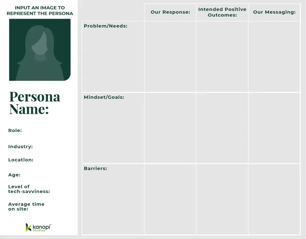
Design user pathways based on what you learn from these personas, and use call-to-action (CTA) buttons and links to encourage visitors to take a desired action.
For example, take a look at the Boys & Girls Clubs of America homepage. The “I am” CTA allows website visitors to choose the user group that best fits them:

After selecting their category, users are sent to a page with resources relevant to their needs and interests. Current and potential supporters can see options for donating, advocating, volunteering, and more.
3. Enhance your website’s user experience for donors.
Your work isn’t finished once you’ve created user pathways. Optimizing the donor journey requires enhancing every element of the user experience (UX). The user experience is the way your visitors interact with your website, encompassing every action they take, from clicking around your online calendar to contributing an online donation.
Create a positive user experience (and first impression for new supporters) by incorporating UX best practices. Getting Attention’s nonprofit website UX guide recommends ensuring that your website is:
- Mobile responsive: Your site should automatically adjust to fit smaller screens, as a large portion of your donors will be connecting with you via mobile device.
- Accessible: Follow accessibility guidelines to ensure your site is usable for all audience members. This includes providing descriptive alternative text for images, captions for videos, sufficient color contrast, and other accessibility recommendations.
- Easily navigable: Keep your navigation menu clean and simple, with just a few menu items that speak to users’ interests and facilitate their information-gathering process.
- Fast: Your website shouldn’t take more than a couple of seconds to load. Otherwise, you risk losing visitors at a rapid pace. Minify your code, optimize and compress visual elements as needed, and leverage browser caching to improve load speeds.
All of these elements should apply not only to your website as a whole, but also to your online donation form. When your form is accessible, streamlined, and mobile-friendly, you ensure that you can keep donors engaged until they actually submit their contributions.
Make sure to also tailor your giving form based on your organization’s mission. For example, healthcare websites might offer an option to give in honor or memory of someone on their online donation pages. This helps make the giving process more personal and fulfilling for donors.
4. Don’t overlook the importance of donor appreciation.
Donor recognition and appreciation are vital to the donor journey because they help turn one-time givers into recurring supporters. Your website can play a significant role in the appreciation process alongside your social media, email, and other marketing efforts.
Show donors you value them with the following digital elements:
- Optimized donation confirmation page. Allow donors to share their gifts on social media with embedded, easy-to-use widgets.
- Descriptive, personalized email receipts. Customize each thank-you email with donors’ names and specific details about their gifts.
- Impact information on your blog. Don’t just tell donors their gifts made a difference— show them by providing detailed impact information via your email updates and blog. Incorporate compelling visuals, videos, and direct quotes from beneficiaries to illustrate the positive difference donors made on your mission.
- A donor wall. For those who appreciate public recognition, you could include their names on a digital donor wall along with their gift amount.
Gather relevant metrics such as time on page, bounce rate, and email open rate to assess the effectiveness of each appreciation effort.
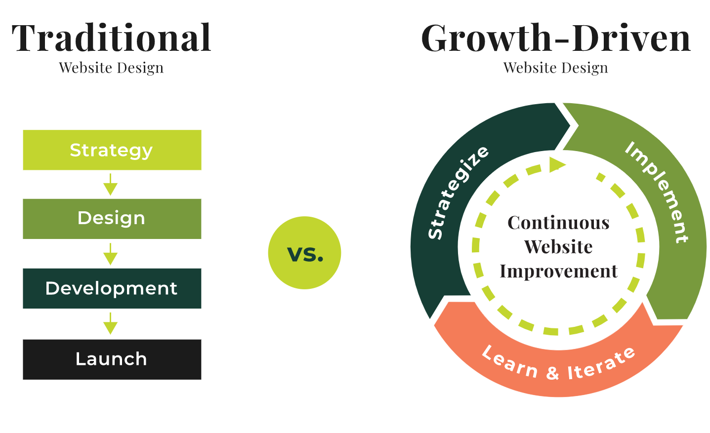
5. Adopt a continuous improvement approach.
Continuous improvement involves making small updates to your website over time that enhance its performance and overall quality. In contrast to the traditional, linear web development process, continuous improvement requires ongoing iteration, strategizing, implementation, and testing, as depicted below:
With this in mind, here are a few strategies you can use to foster continuous improvement:
- Use A/B testing to assess different website elements. This process involves creating two different versions of a web page, such as your online donation form, and determining which is more effective for engaging visitors. For instance, you might change the image used on your donation page to a group photo rather than an individual one, or offer slightly different suggested giving amounts to see if more donors will take advantage of these options. Only change one page element per test so you can pinpoint the specific modifications that have an impact.
- Refresh your user personas in response to new information. As your organization deepens its relationships with donors, you may learn helpful new information about them to further personalize your communications. This could be wealth or employment data or even their donor appreciation preferences. Update your user personas and donor profiles as needed to evolve your outreach strategies as your donors’ characteristics change.
- Conduct regular maintenance to keep your website healthy. Kanopi’s website maintenance guide suggests keeping timely elements like your blog and event calendar updated, staying up to date with CMS updates, and regularly testing your website’s forms. You should also frequently test your website for accessibility and refresh your site in response to new assistive technology.
Making smaller updates to your website allows you to avoid major, costly overhauls, creating a more sustainable organizational culture surrounding web design and development.
If you need more guidance throughout any step of this process, reach out to a digital design agency. These firms can help you fully develop your donor personas, user journeys, and user experience to set your website up for long-term audience growth.
Finally, remember that the donor journey isn’t set in stone. These steps will provide you with a repeatable process you can use each time you want to update your website. Adjust your user pathways as your audience grows and changes or innovative digital techniques emerge.
About the Author: Anne Stefanyk
 As Founder and CEO of Kanopi Studios, Anne helps create clarity around project needs, and turns client conversations into actionable outcomes. She enjoys helping clients identify their problems, and then empowering the Kanopi team to execute great solutions.
Anne fell into the Drupal community in 2007 and admired both the community’s people and the constant quest for knowledge. After holding Director-level positions at large Drupal agencies, she decided she was ready to open Kanopi Studios in 2013.
Anne is an advocate for open source and co-organizes the Bay Area Drupal Camp. When she’s not contributing to the community or running her thoughtful web agency, she enjoys yoga, meditation, treehouses, dharma, cycling, paddle boarding, kayaking, and hanging with her nephew.
Connect with Anne on Twitter, Drupal, or LinkedIn
Did you enjoy this story?
Get nonprofit tips and tools delivered right to your inbox by joining The Nonprofit Leadership Alliance Newsletter. Our bimonthly newsletter will make sure you know what’s happening with our network of social sector leaders.

Revolutionize Member Engagement: 4 Digital Strategies
While many associations struggled with declining membership and retention rates due to the pandemic, these numbers have bounced back strongly as of 2023. However, did you know that the associations reporting increased membership are more

Optimizing the Donor Journey with Your Website: 5 Steps
In today’s fundraising landscape, your nonprofit’s website is more important than ever for facilitating the donor journey. Why? It’s simple—online giving rose from almost 8% of total giving in 2022 to over 12% in 2023
Training Your Nonprofit Team to Use Direct Mail Appeals
Although technology has transformed communication, there’s still something special about receiving a letter in the mail. The anticipation of opening an envelope addressed to you creates a unique connection. For nonprofits, direct mail appeals